
The 7 maps of enterprise design… According to me…
In my work with clients, I often use maps to illustrate where the company stands and the different possible paths to achieve its goals. There are many possibilities, but I have selected those that are the most impactful. Some of these maps come from EDGY and the Intersection Group, others from different fields, and some are of my own creation. In all cases, they are designed with the EDGY language in mind, to facilitate the transition between each of them.
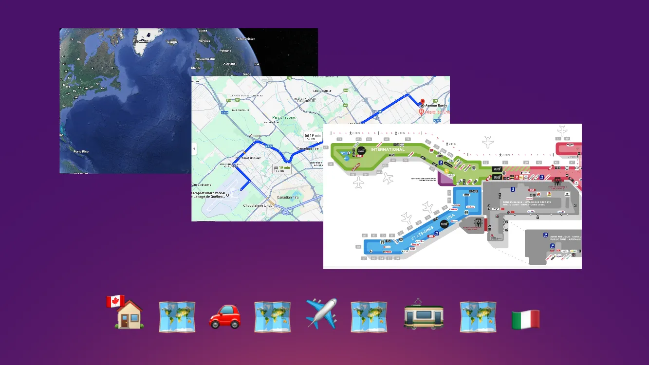
Why multiple maps? It’s just like real life. To get somewhere, you use multiple maps with different key information and levels of precision to know where you are and locate where you want to go.
From one map to another
Based on my knowledge of wayfinding, atomic design, information visualization, and theories on cognitive capacities, I’ve created a system of maps to better navigate enterprises.
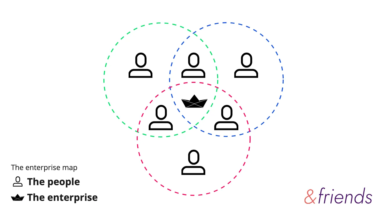
The Enterprise Map
Every company brings people together around a common ambition.
This is where we define what “the enterprise” is. Are we talking about the entire Organisation? A digital transformation project? A team working toward continuous improvement?
And of course, who are the people involved in this company? Who needs to be at the table? Do I have the right cast of people?
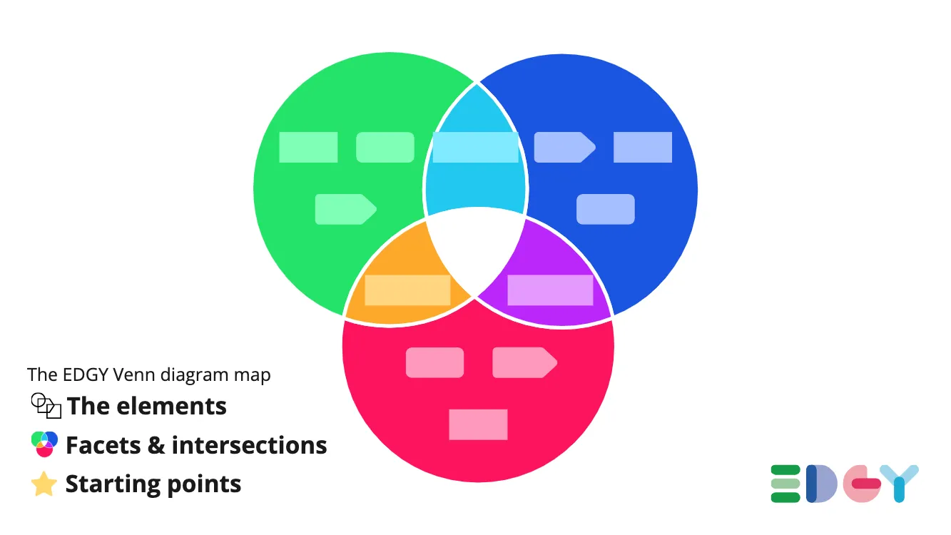
The Venn Diagram
A common ambition requires context, provided by a shared language.
This map gives context to the elements.
By using the same conceptual model to share our perspectives, it becomes possible to create a shared vision of the company. This way, each person can more easily become autonomous and understand their impact within the enterprise.
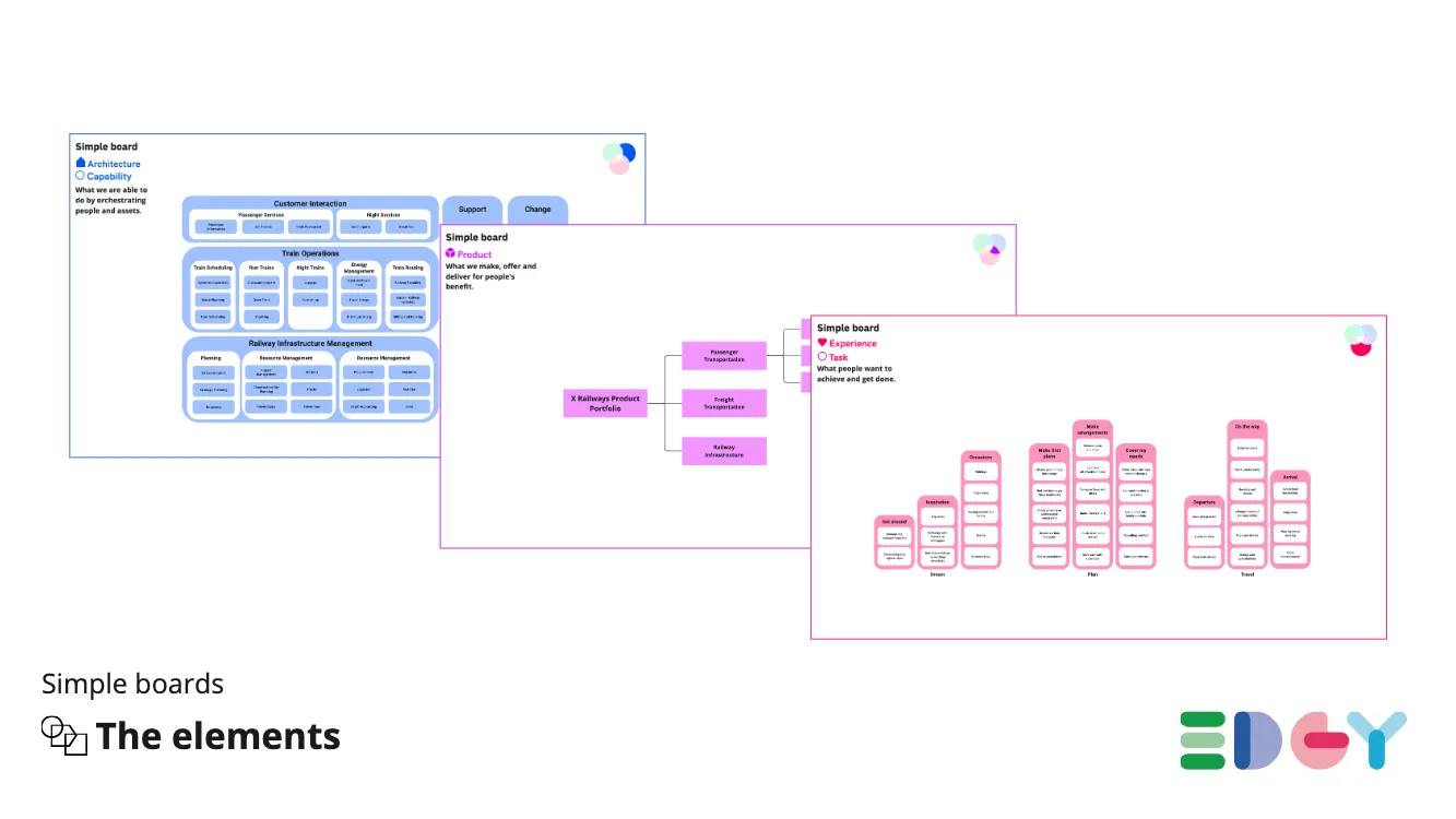
The Simple Boards
This shared context consists of several elements within the company.
This type of map is a list of elements. It structures the users’ tasks, the company’s capabilities, processes, and the company’s purpose. The idea is that, if it’s not documented, collaboration becomes more difficult.
An example of a task would be: If our client wants to travel to see their family, they need to find a place to stay, choose a method of transportation, buy a ticket, decide how long they will stay, and plan meals along the way. Only after listing these tasks can we have a conversation about which tasks we can accommodate with our products, which ones we can handle now, whether we need to add a capability, and whether we should implement it ourselves or form a mutually beneficial partnership.
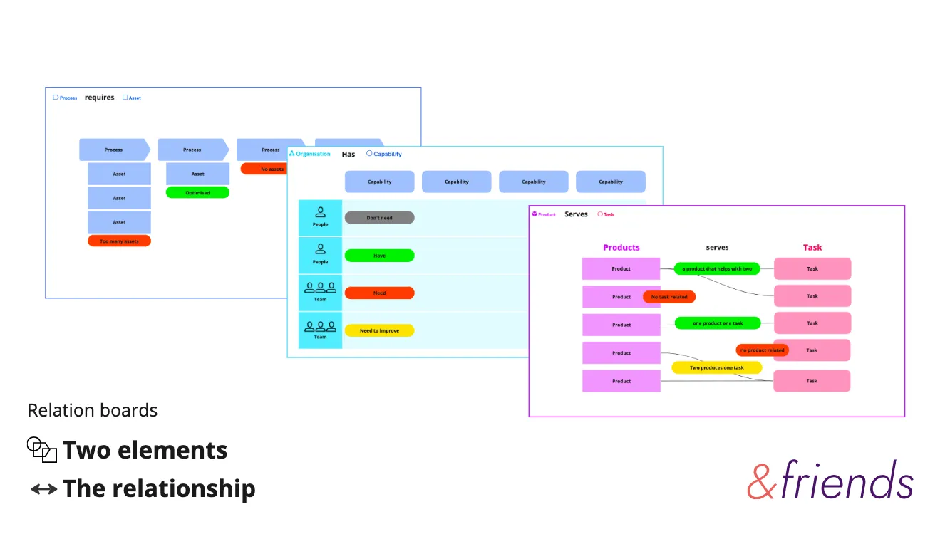
The Relations Boards
These elements are interconnected
These boards help link two different types of elements. Since these elements are interconnected and part of a whole, it’s important to visualize these relationships. This allows you to determine whether two elements are connected and are producing the desired outcomes. For instance, you could question having two products addressing the same user need. You might then choose to merge the products or keep just one.
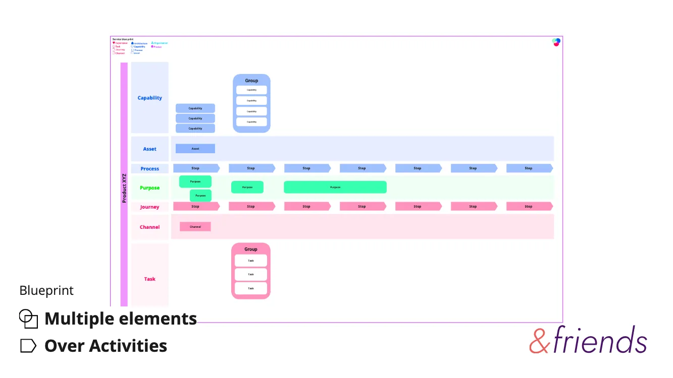
The Blueprint
These relationships exist within a temporal context.
This map links multiple elements within a time-based context.
You can juxtapose your company’s internal processes and capabilities with the user journey and communication channels. The 16 elements can be used based on your context.
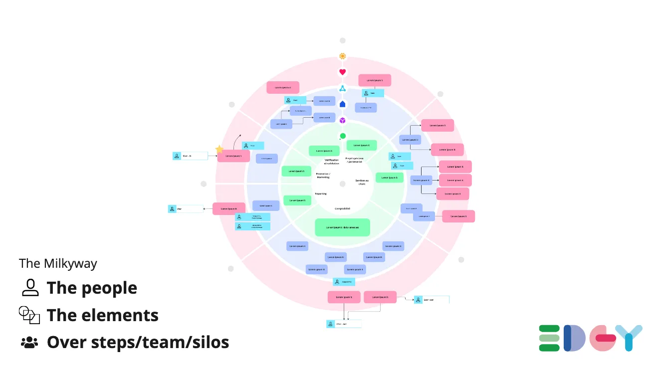
The Milky Way
The company is divided into silos or stages to optimize activities.
This view of the company represents a larger part of it. The circular shape implies that a company creates something, produces a good, learns, and repeats the cycle. Generally, it’s divided into stages or silos. This helps you establish connections between these divisions and ensure the whole system is functional.
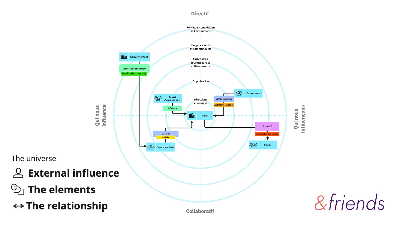
The Universe
The company influences, and is influenced by, external forces.
The Universe map is used to visualize what influences the company and what the company influences. This way, you can see how various elements of your ecosystem influence each other and understand your impact on it.
There are an incredible number of maps, but this set aligns well for designing a company. If your favorite map isn’t included, don’t worry—it’s possibly reserved for experts. In the next article, I’ll present the 3 levels of precision I use for creating these maps.